Sufretak - Designing for the other side of the table
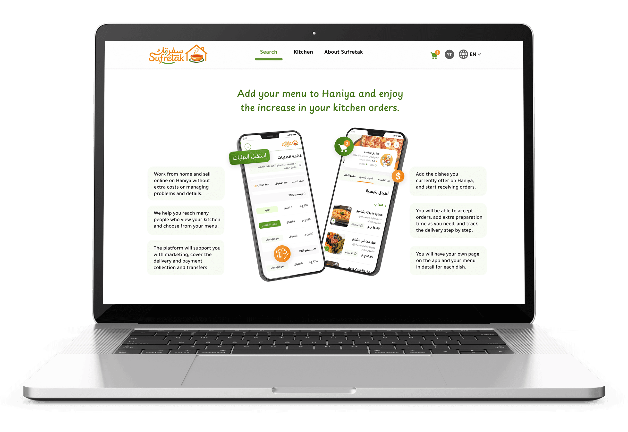
How I designed a marketplace that connects talented home chefs with customers who are tired of restaurant food, and made sure both sides actually want to use it.
UI/Visual Design | Research & Discovery | Design System | Prototyping & Testing | Dev Handoff |
|---|
End-to-end product designer - from insight to shipped UI
I owned this project from the research phase through to developer handoff - which meant I had to think constantly about two very different users at the same time: a chef who doesn't want to deal with complex tech, and a customer who wants to trust what they're eating.
The Problem
Food delivery apps in Egypt are built around restaurant logistics. But there's a massive, people who want real home-cooked meals, and a hidden pool of talented home chefs who have no professional platform to reach them.
"The design problem wasn't really about food — it was about trust at scale"
The challenge
Challenge wasn't just to build "another delivery app." It was to design for a completely different trust dynamic: customers handing money to someone who cooks in their personal kitchen, and chefs putting their reputation on the line with every dish.
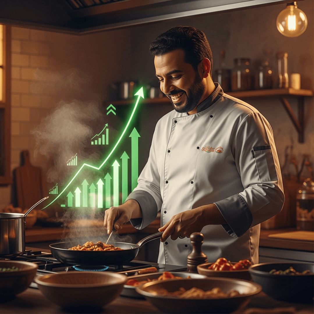
Success Metrics | |
|---|---|
Completion rate
|  |
First order conversion
| Repeat order rate
|
Why I defined metrics this wayVanity metrics (downloads, signups) don't tell you if the design is working. The metrics above are behavioral, they tell me if people are actually doing what the design was meant to help them do. If chef completion rate is low, the onboarding is still broken. If repeat order rate is low, the trust layer isn't working. Each number connects back to a specific design decision I made. started by listening, not designing | |
I started by listening, not designing
Before touching Figma, I spent time understanding both sides of the equation. I conducted interviews with potential customers and, more importantly, with home chefs — because I knew the product would fail if chefs didn't want to use it.
What surprised me most from research | |
|---|---|
Chefs weren't afraid of the competition. They were afraid of the technology. Every chef I interviewed had abandoned at least one other platform because the registration process felt overwhelming. The insight that shaped everything: the chef experience needed to feel like a conversation, not a form. | 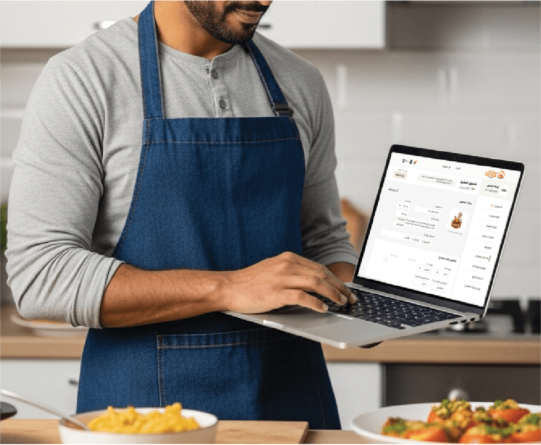 |
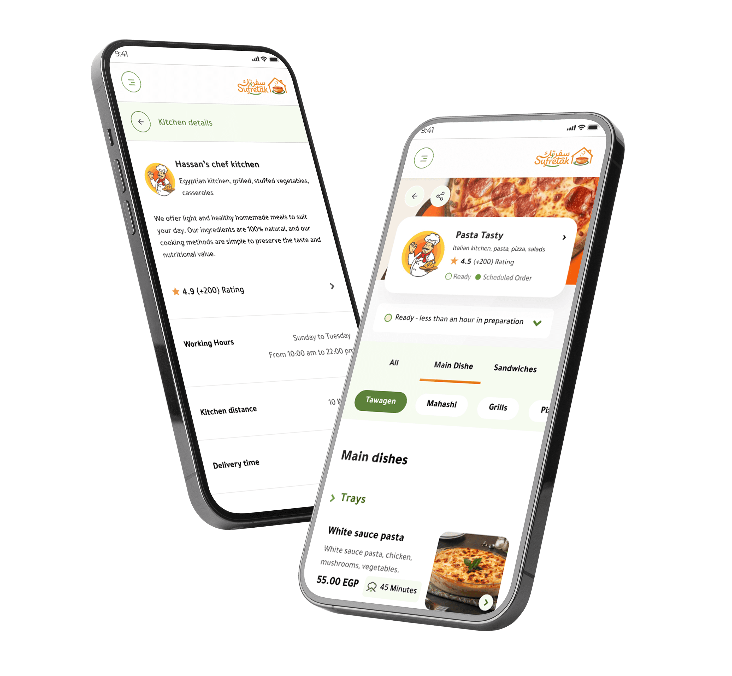 | On the customer side, the core finding was simpler but equally important: people would pay more for authenticity, but only if they felt like they knew who made their food. A photo of a dish wasn't enough. They needed to know the person who behind it. |
Core design challenge: |
|---|
Making chef onboarding feel effortless without cutting corners |
This was the hardest design problem I solved in this project. The platform needed enough information from chefs to build customer trust (location, food type, photos, pricing) but every field I added was a reason for a chef to drop off. |
"The best UX decision wasn't simplifying the form. It was removing the pressure to finish it"
The choices that shaped the product
Design system before pixel-perfect screens Why: With three surfaces (app, web, dashboard), consistency was a product requirement not a design preference. The system also made dev handoff significantly faster. | Meal scheduling, not just on-demand Why: Mapping the design to real constraints instead of fighting them. Scheduling also reduces chef anxiety and food waste. |
Dashboard analytics built for non-tech chefs Why: Chefs are culinary experts, not business analysts. The dashboard empowers them without making them feel like they're learning software. | Verified reviews with chef responses Why: Trust is bidirectional. Chefs need to feel respected too, the ability to respond gives them a voice and reduces the power imbalance of star ratings. |


